Monitor Color Calibration is a process of adjusting the monitor or hardware that controls the monitor to show colors more true to the file, and the resulting print. There are a number of different ways to go about calibrating a monitor, and each offers a different level of accuracy. Once calibrated, you can download ICC Profiles from us in order to soft proof various products from home.
First, we will be discussing how to calibrate your monitor by eye. This is the least accurate way to do it, but it’s free and something is better than nothing. The process consists of adjusting the monitor’s settings such as the Brightness and Contrast controls (which are usually buttons on the monitor itself.) These settings are dependent on one another, so you may have to go back and forth between adjustments to get it right where you want it.
While you can calibrate off of the images on this page, we highly recommend comparing to a physical print from The Photo Touch Pro while adjusting the RGB values of your monitor. It is also important to note that not all the controls listed are present on all monitors. Many laptops have very limited controls in this regard. If you are having trouble getting a good result or your monitor does not offer the controls necessary it is sometimes possible to adjust these settings using your video cards’ software instead of the buttons on the monitor, though this process will differ depending on the video card manufacturer.
-
Brightness
The background is solid black RGB(0,0,0). Increase the brightness until you can see something appear in the animation below by step 8 or at least step 12.
The idea here is to brighten the screen until you can distinguish black from very dark grey. This will let you more accurately see shadow details of an image on-screen.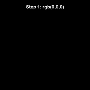
*only a high quality well calibrated monitor will show distinction in each step
-
Contrast
Adjust the contrast until the gradient below transitions smoothly from solid black at one end to solid white at the other. If set correctly with brightness, this will maintain highlight detail of an image on-screen.

*Some banding is common when viewing the above gradient
- Gamma (where available) should be set to 2.2
- Temperature (where available) should be set to 6500k (or D65). This control is sometimes superseded by the Color RGB values. If your monitor has both controls, see if you can get a better result with RGB. If not, set the temp to 6500.
-
Color (R, G, and B, where available)
Adjust the R, G, and B values until the gradient appears color neutral.
If it looks yellow, add blue.
If it looks cyan, add red.
If it looks magenta, add green.
Our Brands